Saturday 8 March 2014

Evalutation 4- Technology we used through out


Below is a list of all the different technological items that my group and I used for the making of the video, and some infromation to why I used each type.  The Nikon camera and the iPhone were best at capturing the slow motion bits, and the FujiFilm camera was most suitable for the under water filming. 
Adobe After Effects was perfect for the editing and seemed nicely compatible to link all our video footage up to.

Adobe After Effects:  This software was used as we already had it, and members of the group were confident at using it. It has all the effects that we could have needed plus more 

Samsung laptop NP300E5C: Used for parts of the editing. Able to handle many tabs open at once, as I have experienced.

Nikon 1: Though small, it is able to shoot in in 720p at 60fps. this made it really suitable for the timelapses, as it has to capture in really high quality. The cameras lens is also great at shooting in the dark, meaning the florescent dancing scene was capturable.

Iphone 5s: This phone was particularly useful due to it having a slow motion mode one it. This meant it was suitable for the filming of the bicycle slow motion bit.

Alienware: this laptop was perfect for the job of the more hard core editing. It has a very powerful i7 processor meaning it could cope with having all the film footage on it.

FujiFilm XP50: I used this camera for the underwater shot of the girl swimming. The camera was perfect for the job, though it was sometimes hard to get the lighting write as focusing under water can be tricky, specially as I kept floating to the surface, and I can not hold my breath long.
HP Pavilion dv6 Laptop
Used for the blogging and vlogging. It was also used for some bits of editing. This laptop can handle a lot. 
 
This is the blog website that I am using. It has been fantastic to use as well as simple and easy to publish on.


Wednesday 5 March 2014

Evaluation 3, Audience feedback, Facebook feedback, and YouTube Views

I went around my boarding house at school and showed a few people my music video. The above video is of these people giving there feedback about it.


I also posted my video on Facebook and asked people to watch it and post there thoughts and feelings about it. below is the feedback I got. 


I have also had over 300 views on YouTube 
 
 
Below is the section on youtube where it has the stats


Thursday 20 February 2014

Evaluation 1 - Directors Commentary

This is a highly edited version of my music video where I speak about why I made certain choices in it while making it.

Wednesday 5 February 2014

5. Mock up of our advert

We have used the same fonts as we have used on our digipak, as well as showing our digipak front cover. This is so anybody viewing the magazine and wants the CD, knows what to look for.
The background image is one similar to a shot in our music video. I thought that this leaves the viewer with an open mind to what the music video is about.

4. Flat plan of advert

This is the the flat plan of the advert I am going to make. It would be suitable for a magazine and would have  the appropriate colours in it to suite our song. behind the writing there is a pair of boots warn by the mother of the character in our music video. I have put in a barcode as well as the production company Columbia. The reason I have put in a picture of the album artwork is so that anyone that wants to buy the CD, will know what to look for, and expect.

2. Copy an advert

 Below is a copy that I created of the Labrinth advert that I first found in a magazine. We have added the producer and barcode, as they were on the following page.

Tuesday 4 February 2014

1. Album Advert

I have picked a different MGMT song called Electric Feel. I have been analyzing how they advertised there song when it was released, they used the below poster as one of there marketing techniques. My song, Kids is the same genre and follows the same sort of theme as Electric Feel. This means that it is important that my Kids cover gives off the same feeling as Electric Feel, as similar sorts of people are going to listen to the Audience.
It is important that there is synergy in the following areas throughout my advertising campaign for this song.
  • Adverts on TV
  • Concerts that the band do
  • The look of the album artwork
  • Posters
The above image has the following significant traits which make it similar to our Kids poster, therefor making it suitable.
  • Large bold writing
  • Dark black backgrounds
  • Colorful large letters
  • Simplistic old school look
  • Nothing to complicated

Monday 3 February 2014

9. Audience Feedback

The above video is the feedback from the people that looked at my digipak below.

8. Our digipak

This is my digipak for our album. We have used all of our chosen fonts and stuck to all our plans.

Sunday 2 February 2014

7. Flat plan of our digipak

Above is the flat plan of our digipak and what it is going to look like

Monday 27 January 2014

5. Copying a digipak - Bastille bad blood

This is the front of the original digipak that we are going to copy.

This is my group finishing it in photoshop

This is the website where I downloaded the Bastille font


This is my group working on it in Photoshop


We have also added a letterbox style to the picture, now it looks similar to to original Bastille one

Now we have added a dark effect around the edge of the picture

Half of the above moon clip has been used, it has been made yellower, and a flare effect has been added.

Though this image is watermarked, it was still usable as the man needs to be so small. We have managed to reverse the image as well as add in some trousers.

This is the original image we are using as the base of the picture to work with.


 This is the back cover of the original digipak.


This is my copy of the above digipak cover

 This is the final stages of the photoshop process.

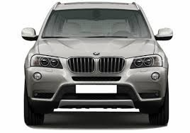
This is the car that is used in the above pictures.

This is the copied image that we have Photoshoped to go on the inside.

This is the original image that we have used for the copy.

Friday 24 January 2014

Final cut Kids by MGMT music video


This is our finished music video. It is about a girl  who is imagining what her future could have been like if she had not had a child.  The video relays the feelings she thinks she would of had of this happiness and freedom, demonstrated with dance and open spaces. As a viewer we see that the character may not be as unhappy with her current life as she perceives, as she seems to love the child very much.

Tuesday 21 January 2014

Almost final music video

This is our music vido in its very final stages. I have finished all the filming, and just need to do a tiny bit more editing as well as add some effects and overlays.  Almost there.....!

The making of the film...

The above image is me editing together my music video. I have got all the clips, and have started to do some rough cutting and editing so it goes with the plans. This is so we get a rough idea of what it is actually going to feel like before we synergise it.


This image is of the timeline; here you can see that I am now trying to get it to fit with the music more effectively, as well as apply synergy so it all fits together nicely. 


First session of editing

This is the beginning of our music video as it slowly starts to take shape, we are trying to use as many different ideas and angles as possible so as to keep the video gripping.

4. Digipak rules

This is the front cover to our digipak. As you can see it relates strongly to the feeling that we have portrayed in our video. Like in the video, we have used many bright colours, we have also tried to show the wacky feeling in the cover. I feel the this cover goes strongly with the with the video.
The rest of the digipak will contain photographs from sections of the film. These photographs will be edited in a way that makes sure they keep up the synergy with the wacky front cover.
The above font (pulp fiction) goes well with the other fonts that we have carefully picked for the rest of the digipak, we shall also make sure that the colours come across the same.

Monday 20 January 2014

3. Research the differences between digipak's and CD cases

Above is a video of me, speaking about the differences between digipak's and CD's cases. It also includes information on what a digipak should include.

I have done some research on production costs of digipak's and CD cases. 

  • I found that with digipaks, the average cost of making the whole case is about 24p that is if you buy in bulk of around 1000. Another advantage is that digipak's can be made of recycled cardboard, meaning people that are environmentally concious are likely to purchase. 
  •  However, with CD's if 1000 are made, the average cost would be about 42p per CD, as plastic is more expensive. 

2. Digipack fonts

Digipak Test Fonts…
MGMT
Basic Sans SF

MGMT
Greyhound SF

Pulp Fiction
MGMT
Stylistic SF
MGMT
Garamond
MGMT
Ar Bonnie
MGMT
Courier New
(Digipak fonts we are going to use...
Pulp Fiction
MGMT
Courier New
MGMT
Garamond


Why I have picked the fonts that I have:
I have chosen these fonts as I find they are particularly memorable, this is exactly what I think is suitable in order to make my music video memorable. The fonts also have something playful about them which should make the cover stand out, and appeal to our target age group. The front cover is going to have the font 'Pulp Fiction' because the lettering style is bolder and more exaggerated. The sharp corners symbolise the simplicity that we are trying to portray when someone first sees it. Another reason why I found this font attractive is because it goes well with the 80's/90's theme used in our video.

Saturday 11 January 2014

1. Digipack Cover

Above is the current digipak cover for Kids by MGMT.
As you can see it is very simplistic, and has a slight old school feel to it. The writing looks like it could be a shot from an old news paper as some of the black in it is patchy. It is big and clear, yet has a rustic feel to it.


The above image is the front cover to there latest 2013 album. As you can see, they have used a more different approach and gone for a happier more chilled out feel. It is certainly less in your face than the art work for "MGMT Kids", as shown above.